CONTEXT
Little Helper is a mobile booking app for teams and HR managers so that they can quickly book a room without going to their workplaces.
KEY RESULTS
Booking time reduced by
70%
User satisfaction
92%
CHALLENGES & GOALS
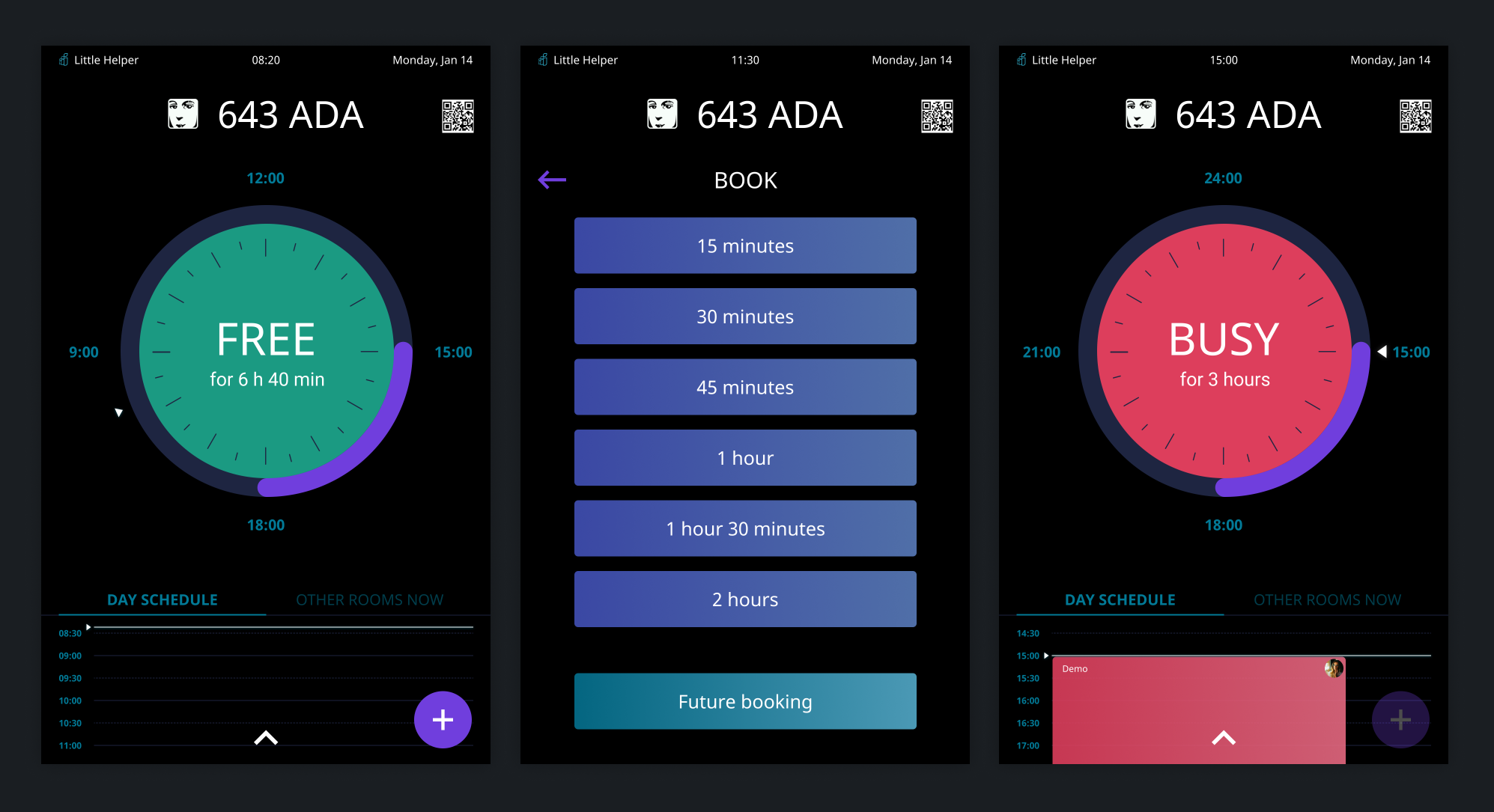
- Create convenient meeting rooms booking app
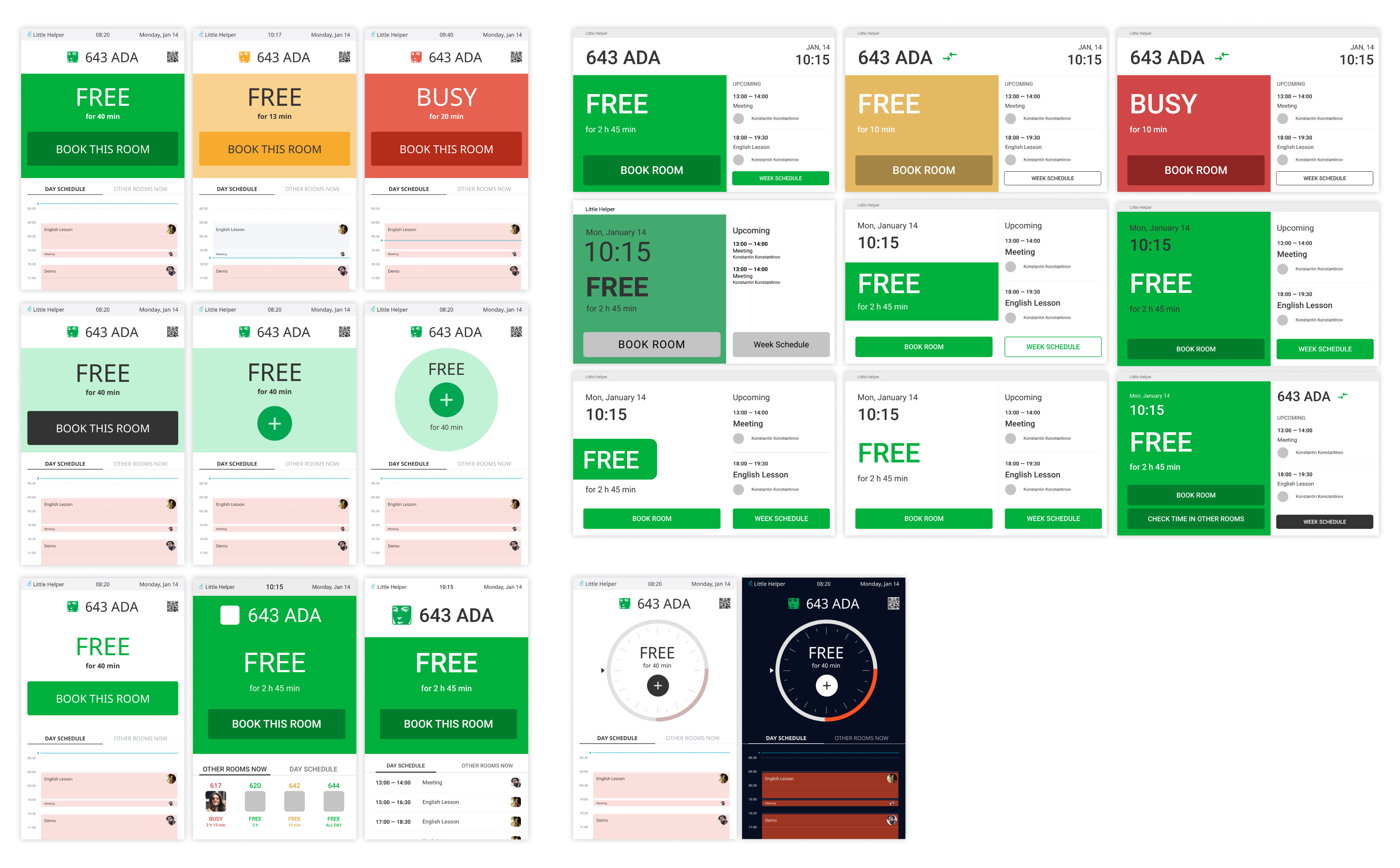
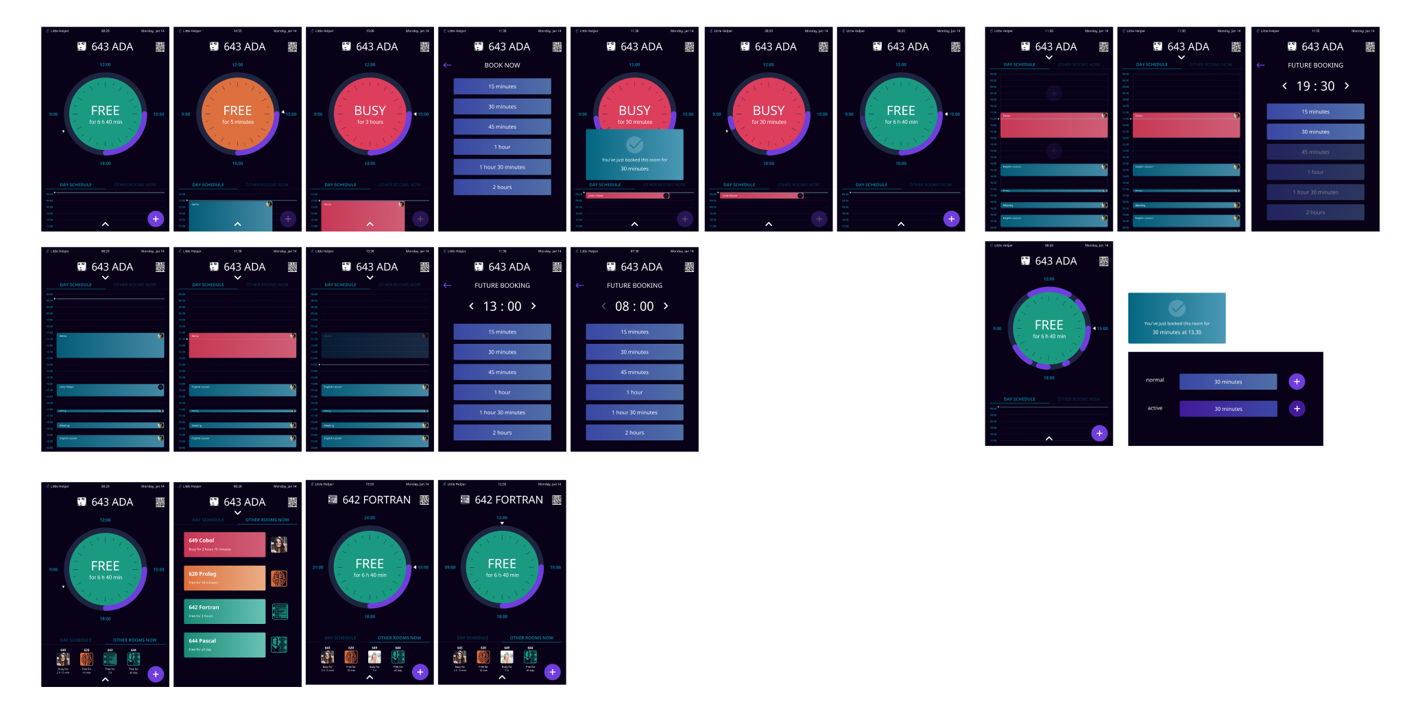
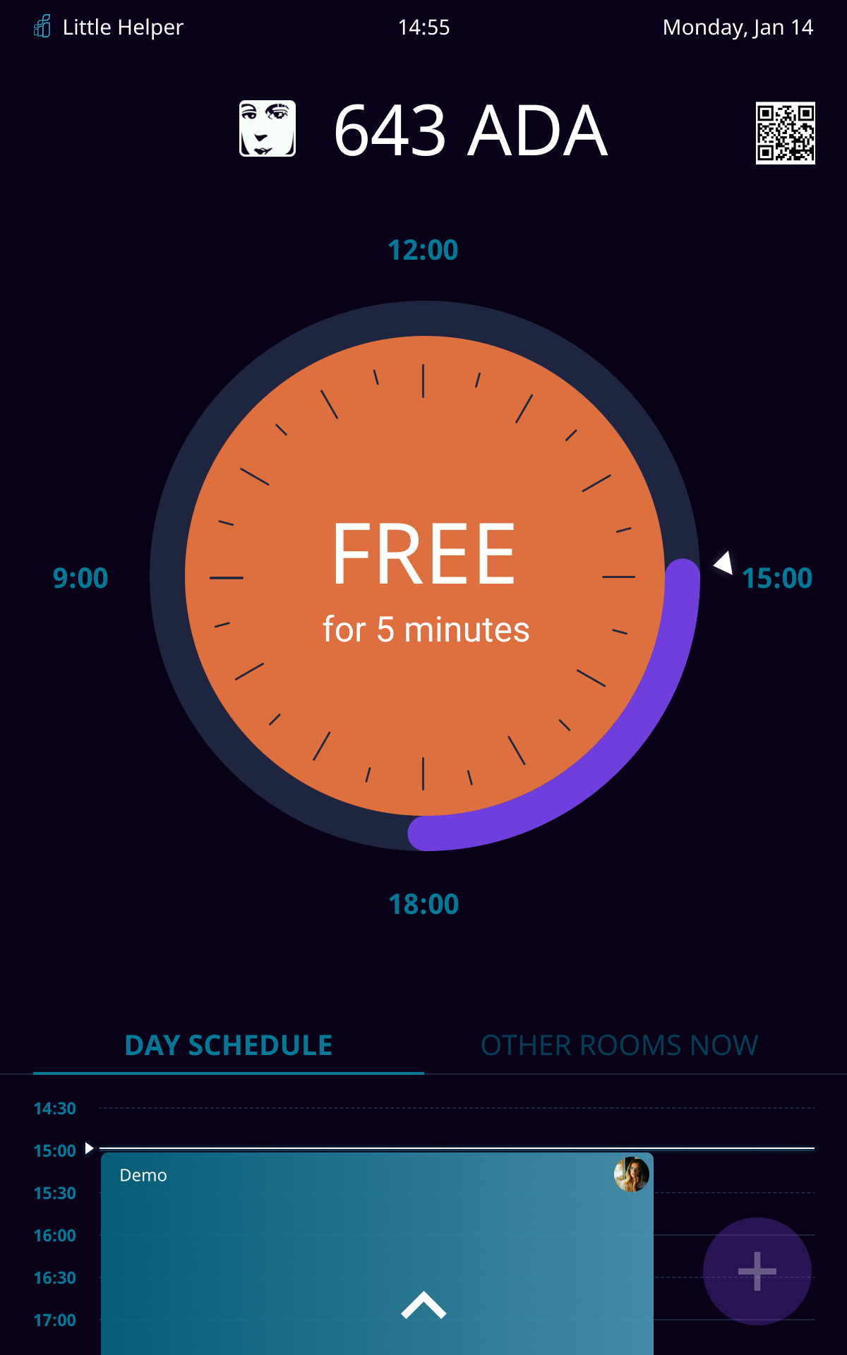
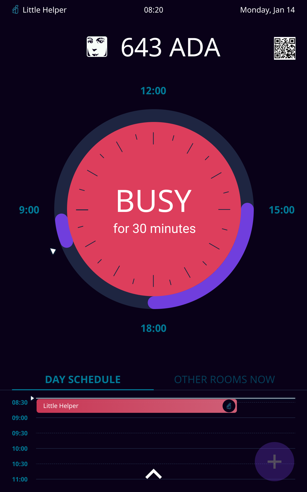
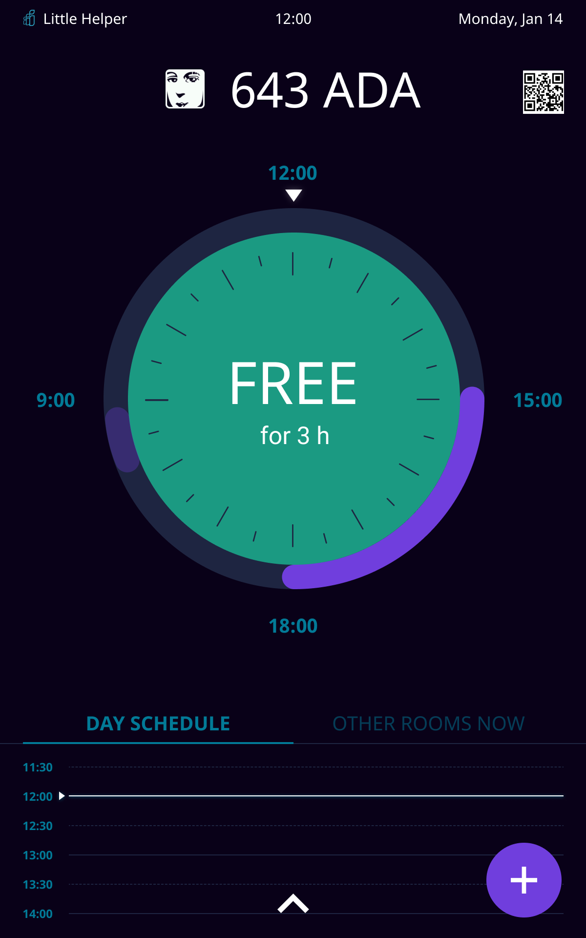
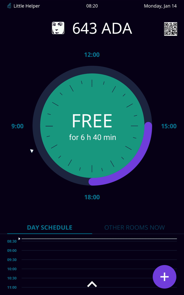
- It should be clearly visible if the meeting room is busy or freefrom a few meters
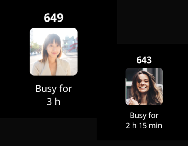
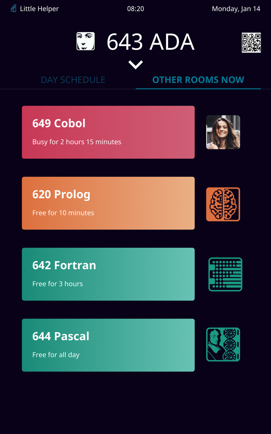
- Person should be able to see statuses of other meeting rooms from one tablet
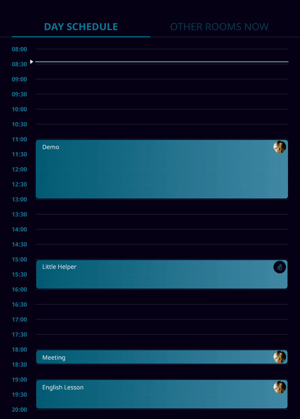
- Person should be able to see the schedule for this day
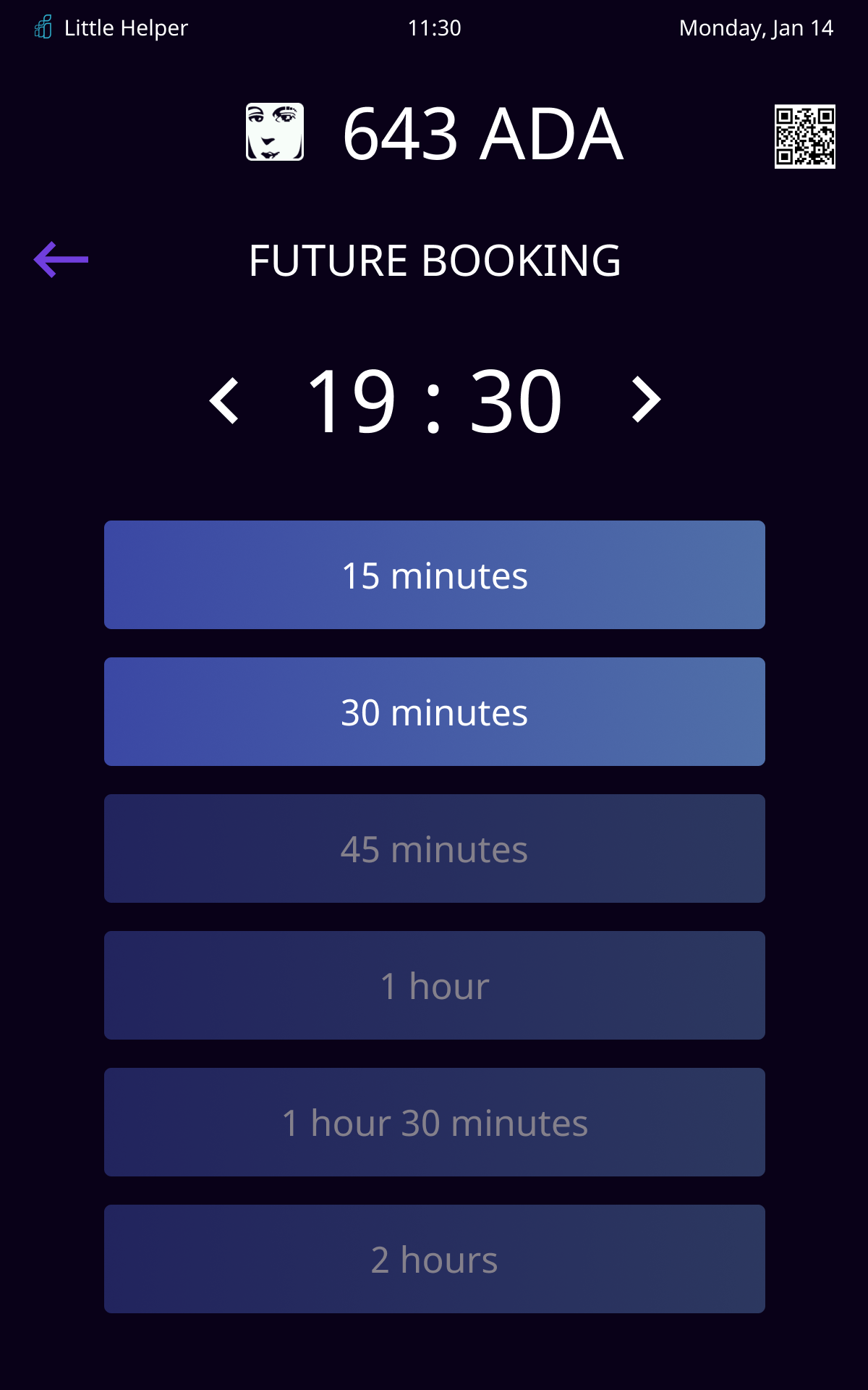
- Any booking room should be able to be booked from any tablet
CLIENT
IT company's internal project for more than 400 employees
TEAM
Designer (me), manager and android Engineer
MY ROLE
Interviewing, concept creating, prototyping, interaction and visual design, user-testing

DEFINING THE PROBLEM
The company has offices on several floors. Employee can book a meeting room only from their workspaces or go and check every meeting room.
A lot of managers asked to have the opportunity to book a room when they stay near it, so that they don't need to go to another floor to their room and lose time.
SOLUTION
We created an app for tablets that were hung next to each meeting room, so now employees don’t have to waste time to find out which rooms are free and which ones are busy. First mvp version was created by manager and developer to find technical capabilities and limitations. After that they decided to ask for my help as a designer to find best solutions, work through use cases and visual style.
The application has been implemented and successfully using for more than six month. We got a lot of positive feedback.
APPROACH
Booking a room should be simple and effective case during employee work day, such things shouldn't irritate people or distract business meetings. I realised the importance of creating a streamlined approach for people to not only give people possibility to book a room here and now but also recognise process which I called 'meeting routine'.
How and why do people hold meetings?What pain points do employees experience when trying to book a room?