CONTEXT
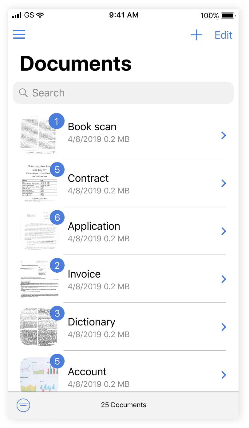
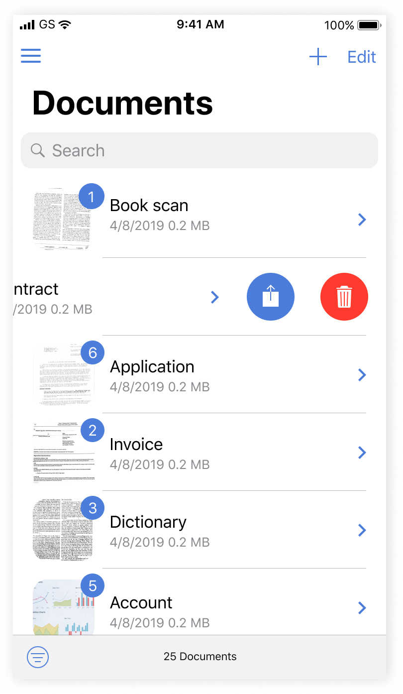
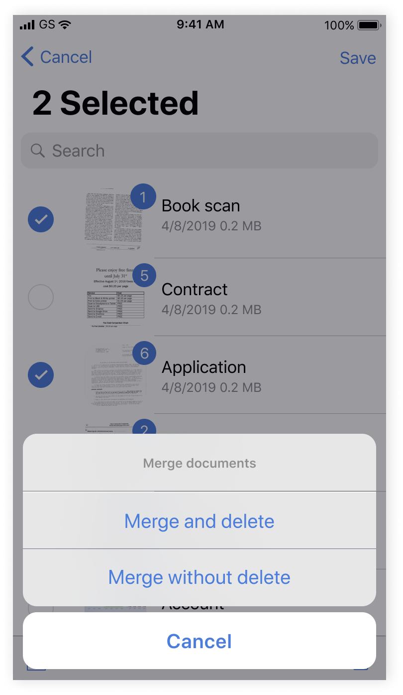
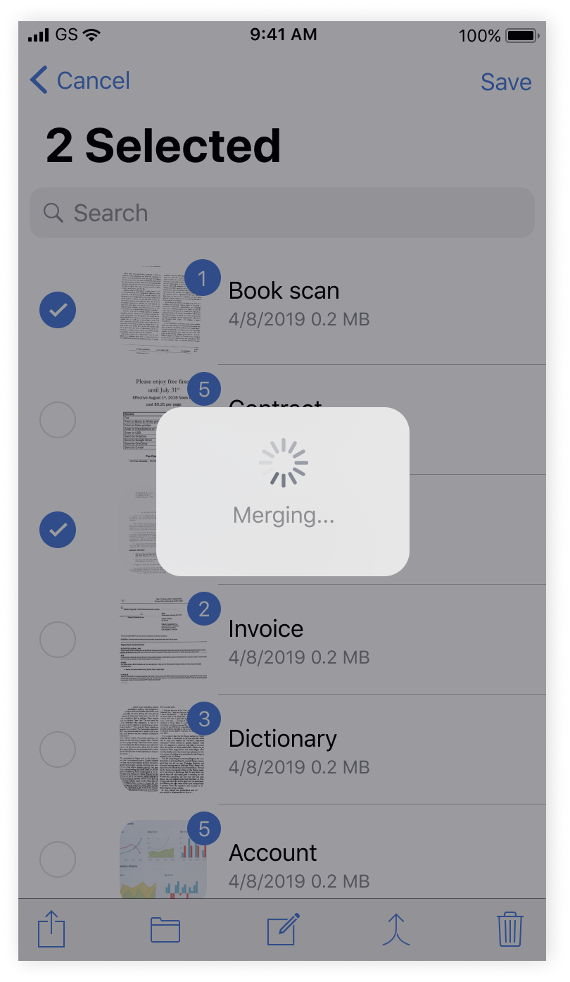
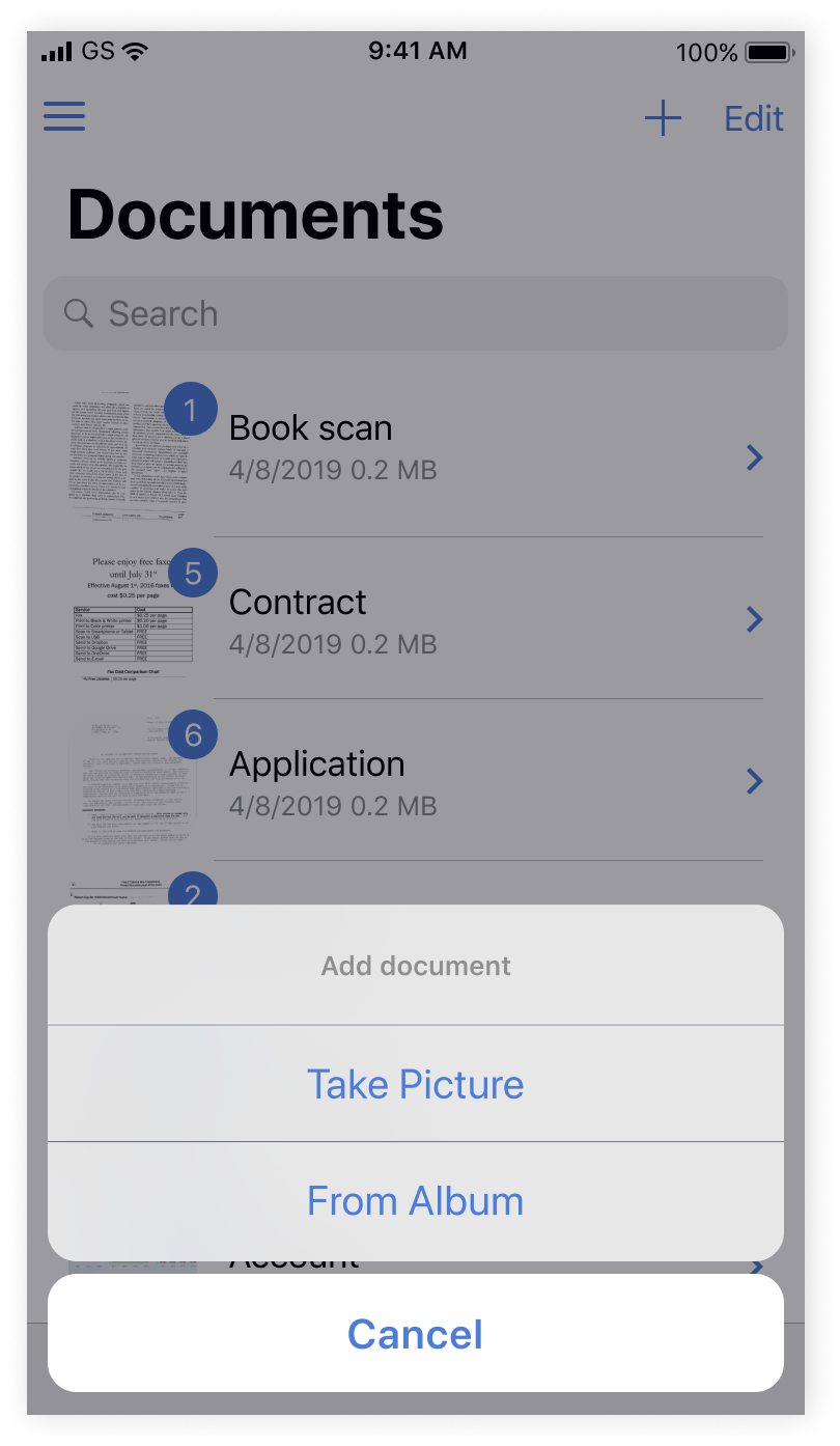
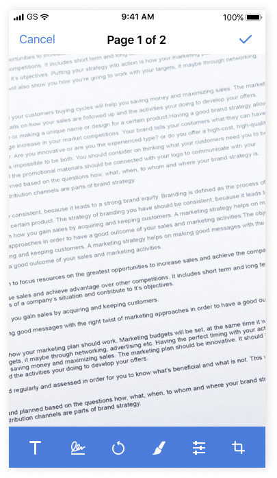
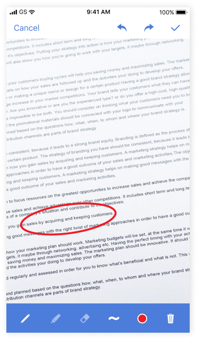
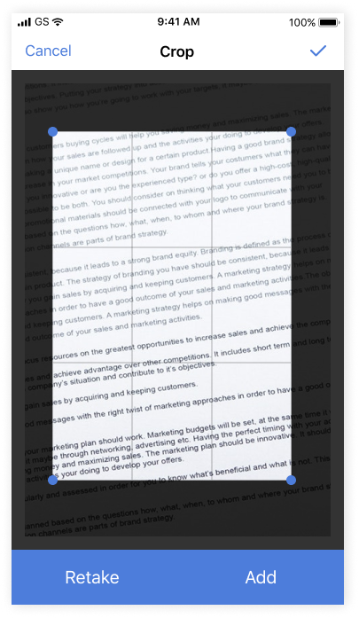
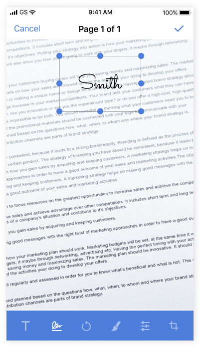
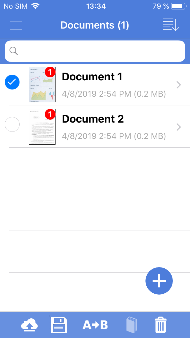
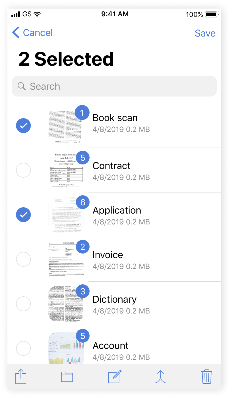
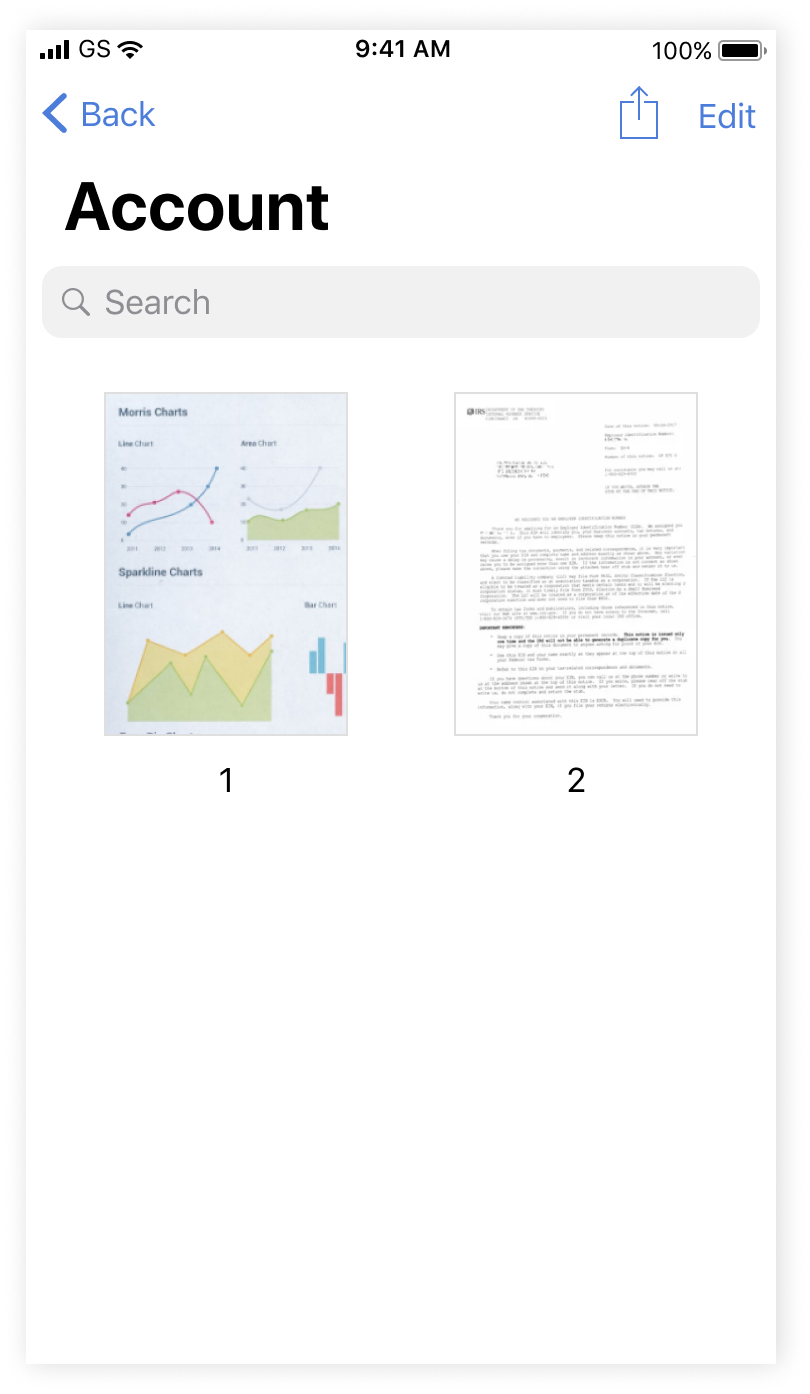
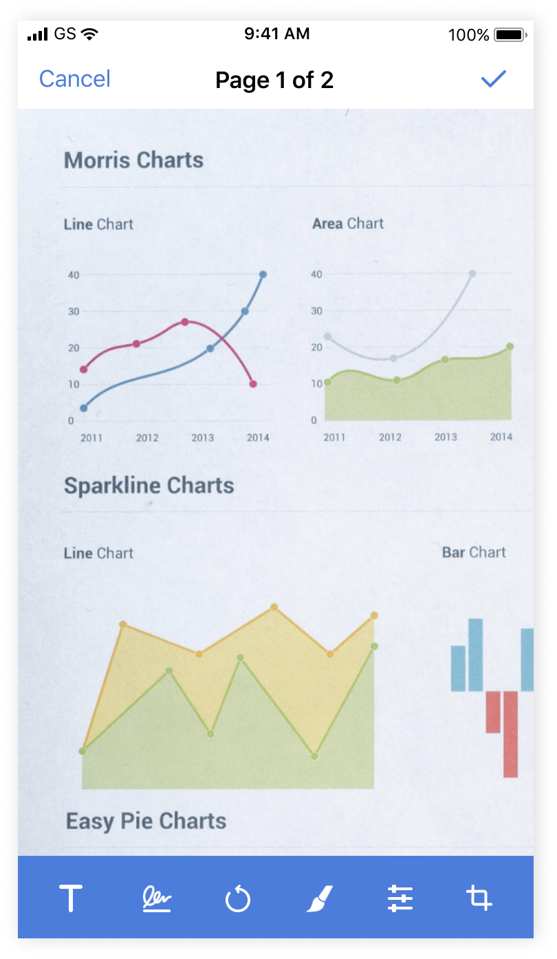
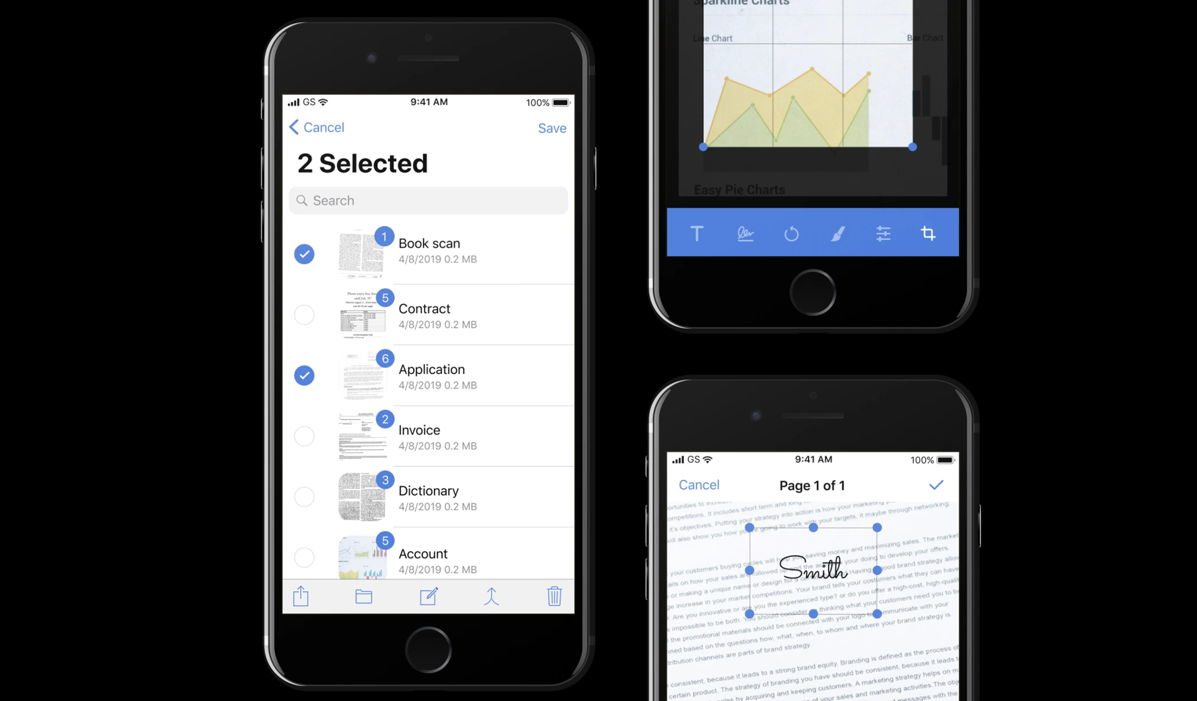
Smart Storage allows you to create single or multipage documents and organise them in folders. You can easily share these high-quality documents and also perform optical character recognition.
KEY RESULTS
iOS App Store rating
from 3.8 to 4.5 stars
CHALLENGES & GOALS
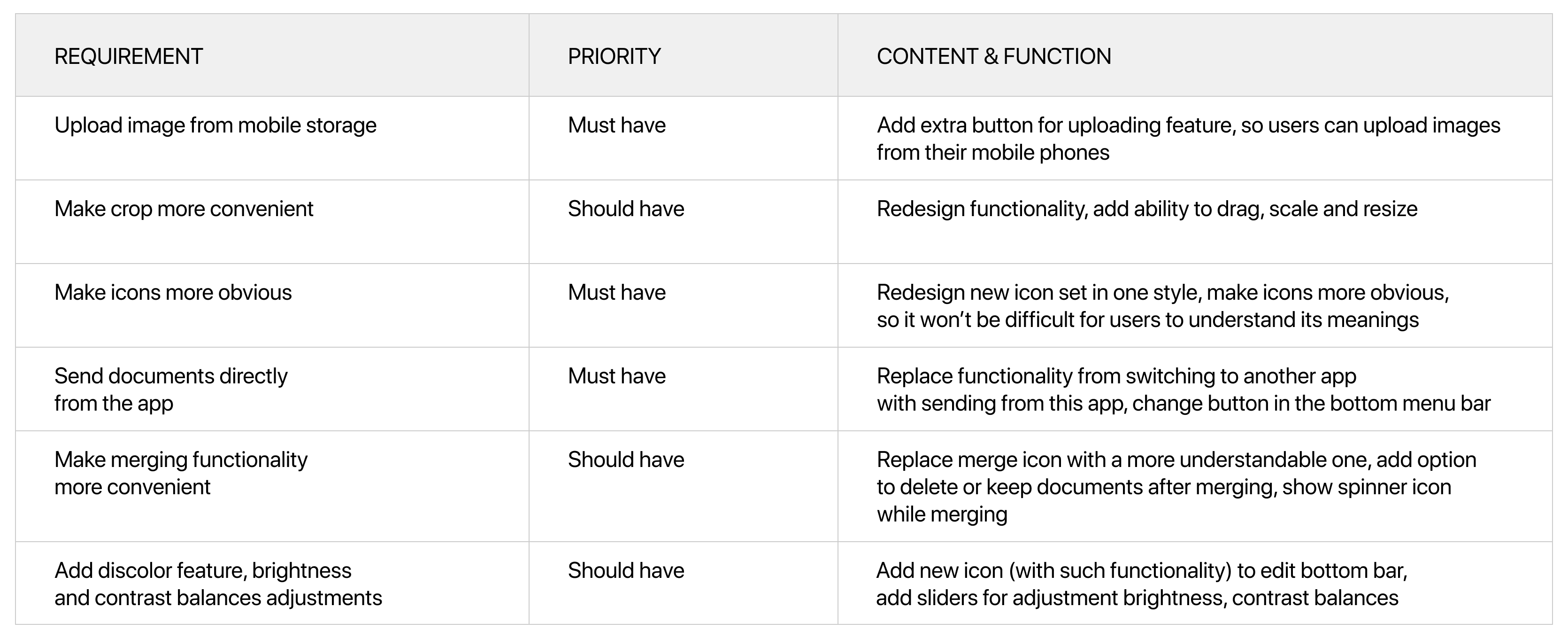
- Investigate, analyze and solve UX problems
- Update UI and redraw icons
CLIENT
American multinational financial services corporation, one of the largest asset managers in the world
TEAM
Designer (me) and iOS Engineer
MY ROLE
Researching, prototyping, user-testing, UX and UI design
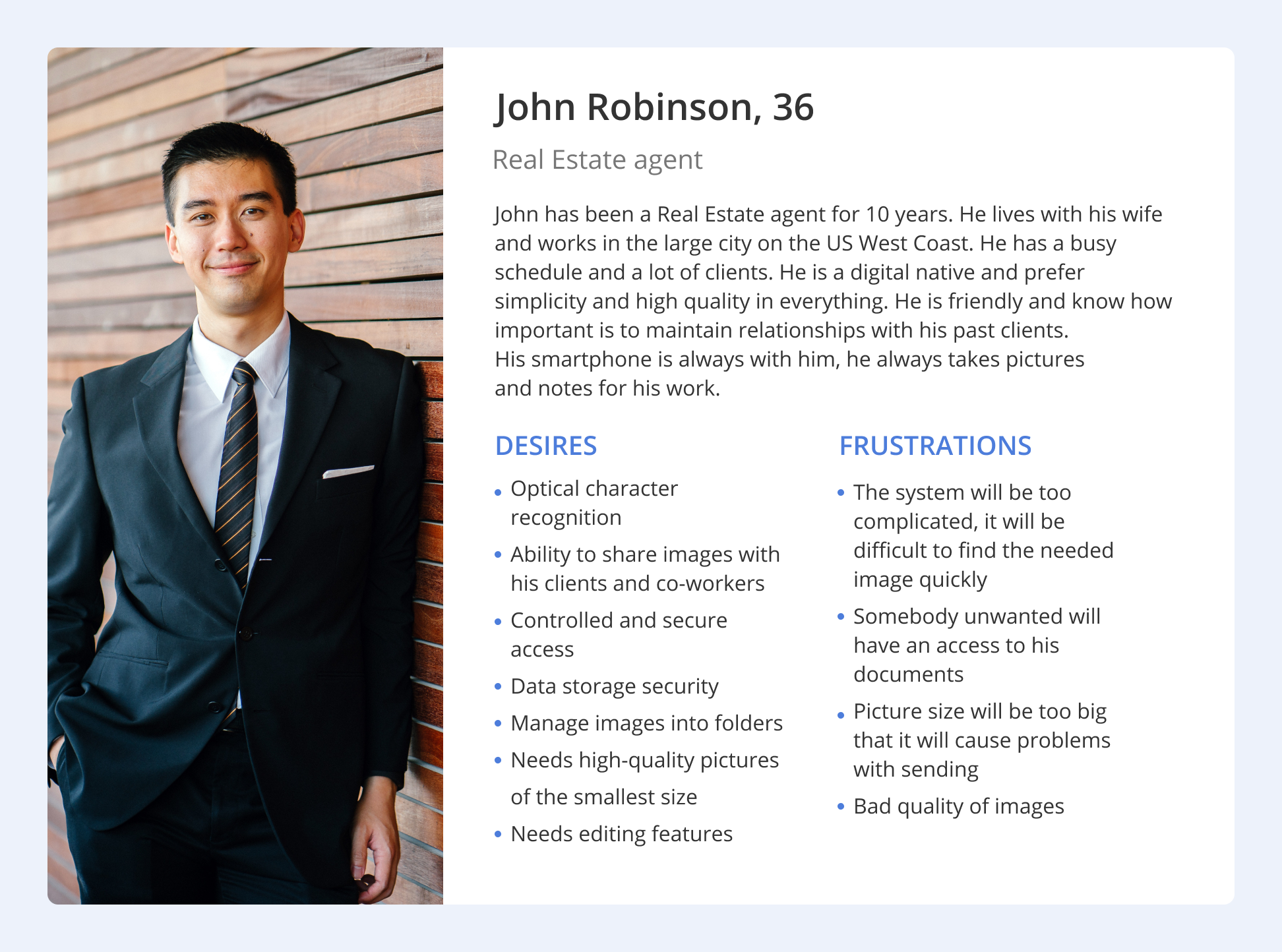
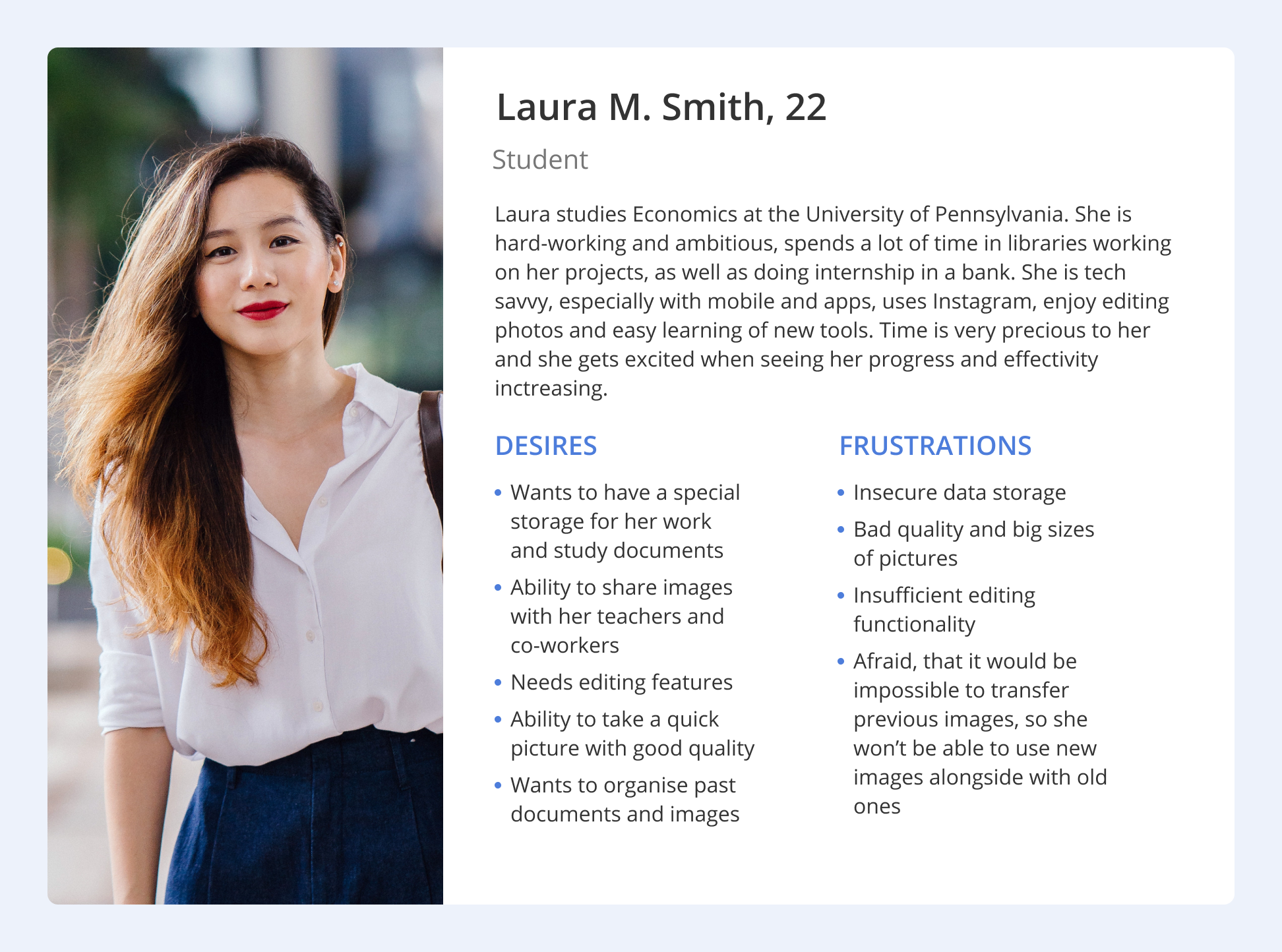
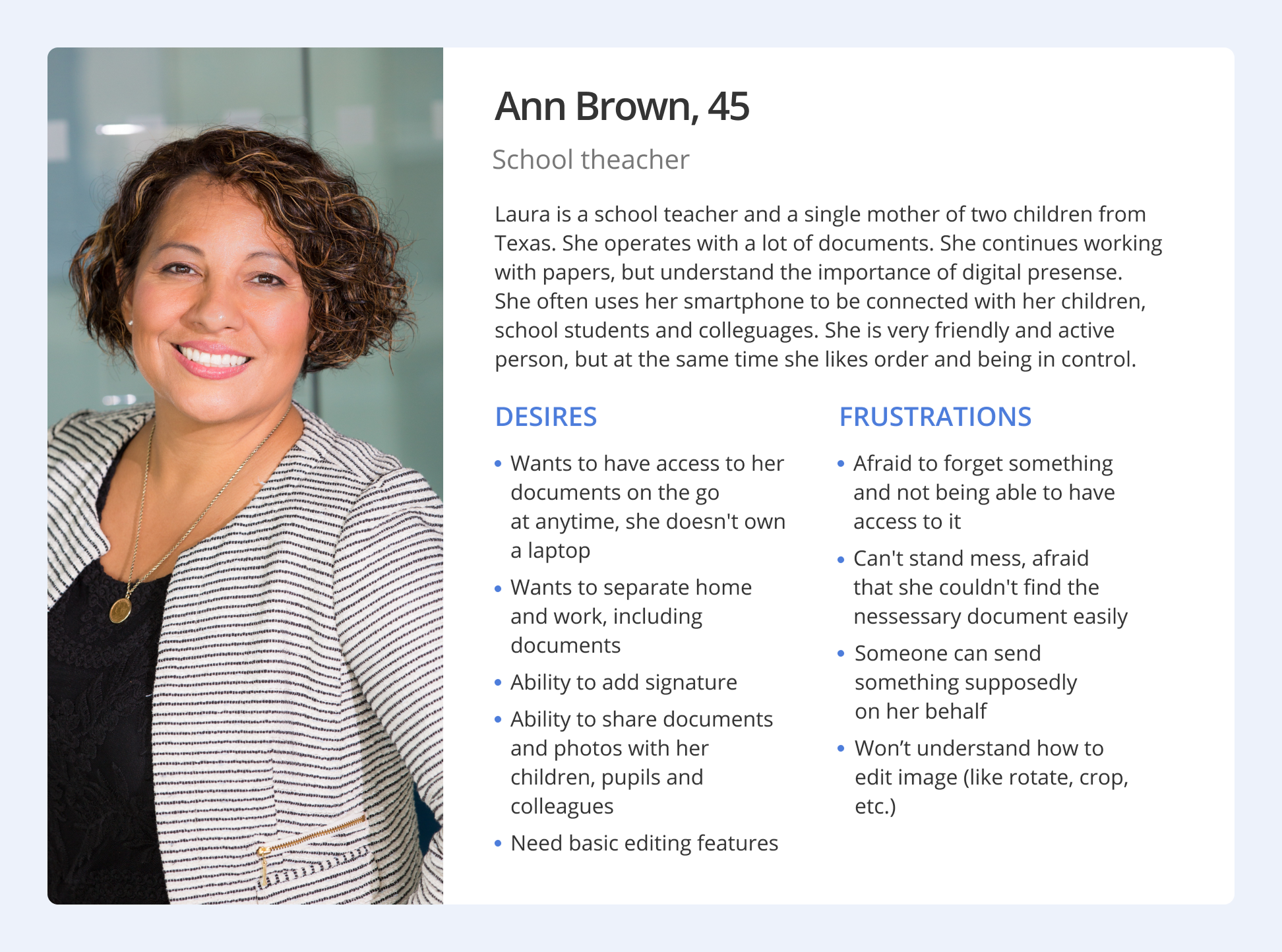
My task was to redesign user interface with only focus on visual design. But I decided to figure out some user experience problems. Smart Storage is a popular app between real estate agents of one US financial corporation, but it can be used not only amongst them.
RESEARCH
I wanted to dive fresh into the problem by getting to know what people using this app thought in order to understand the bigger picture. After interviewing, I lead the assembly and my findings into Personas to visualise the picture to focus on specific questions current and future users needs.
DEFINING THE PROBLEM
How might we reimagine a system for creating, editing, delivery and storage documents and images that can help real estate agents (main number of users), increase number of finance students users and interest teachers and school administration workers (potential users)?
Product goals
ACCESSIBLE
The feature can easily be found and accessed.
EFFICIENT
The process is smooth and frictionless to save time.
Long term goals
FOCUSED TASKS
With their worries diminished, users can now focus on more important tasks.
COLLABORATIVE ENVIRONMENT
The app offers better document sharing and more consistent information delivery, helping users save time.
Due to pain points like complicated editing workflows, inconsistent user experiences, Android-inspired elements in the iOS app, and mismatched icons, the need for a redesign became clear. Beyond updating the visual style I re-evaluated the underlying processes and their cause-effect logic.
IDEATION
With these goals in mind, we brainstormed a map of features along with a feature list in order to understand how the system could work in a broader lens while considering the three target audiences. We have established what current functionality can remain as it is, what can be fixed, and what new features to add.
I was responsible with redesigning all screens for the app, considering the last iOS guidelines and technical limitations. I developed new visual style and added new features.
WIREFRAMING
We decided to design wireframes and mockups for Iphone 8, because according to our statistics this is the most popular resolution among users of the app, after customer approval we made versions for other resolutions.
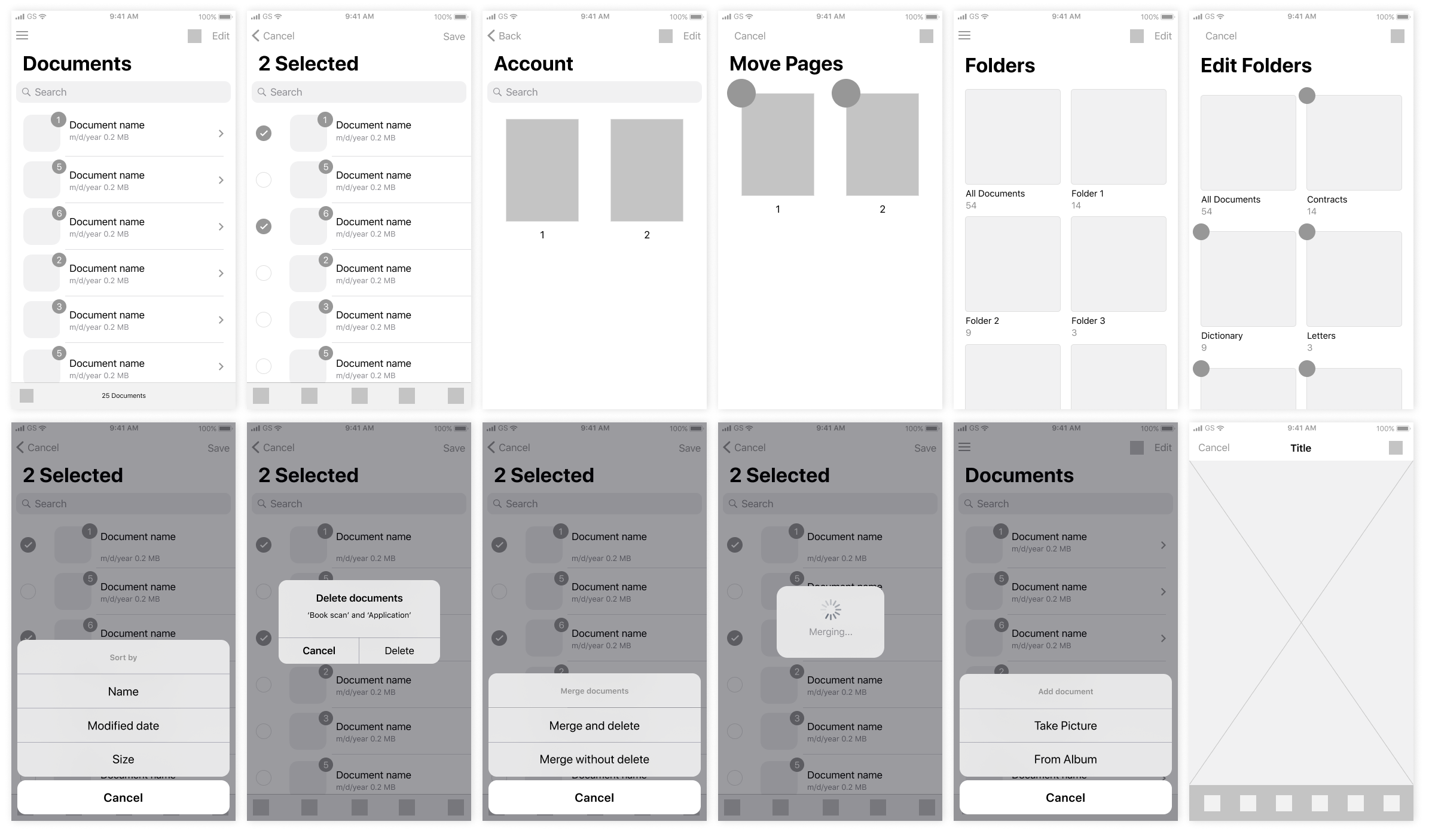
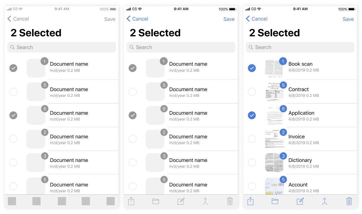
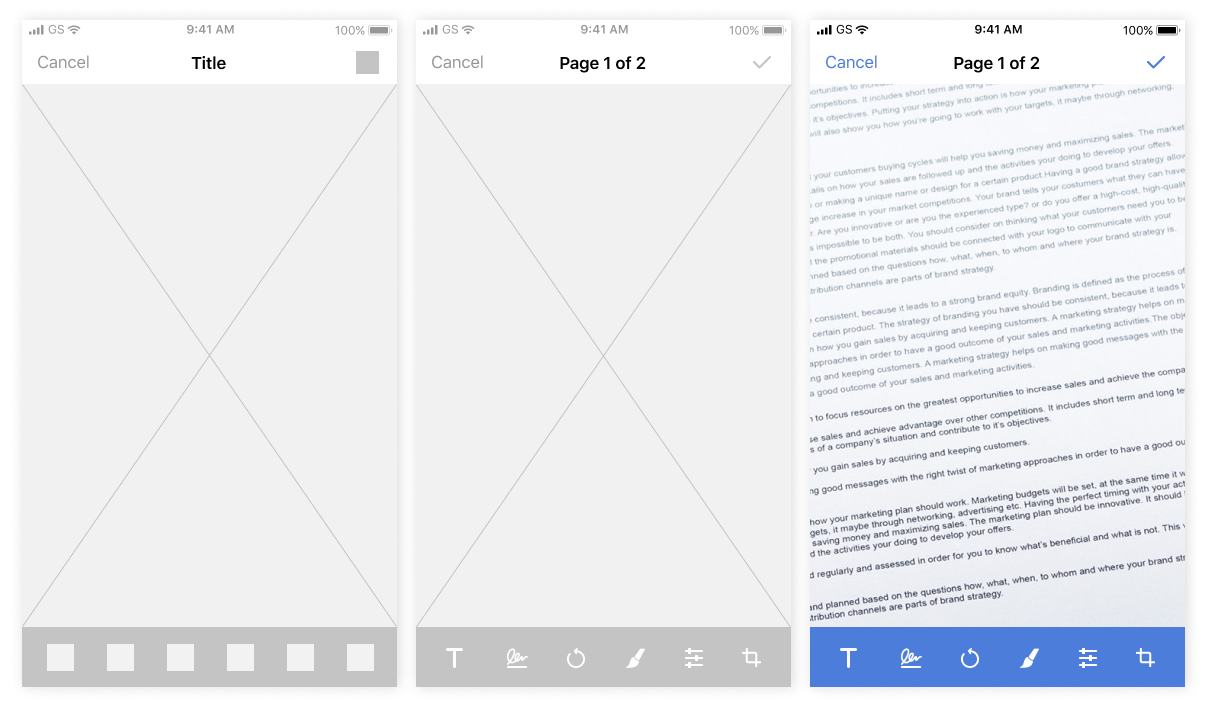
PROGRESS
From wireframes to detailed mockups.
USER TESTING
We got an opportunity to grab feedback by organising real-life scenarios and tasks for our focus group of 6 people to find out do they understand the process of document editing and icon meanings. They spoke aloud their thoughts while using the app. We received very constructive feedback which helped us to redraw some icons and screens and direct our product to the next step.
MAIN FINDINGS
- The flow could be more efficient with evaluating the number of touch-points and time spent
- Guidelines are important, because users have specific habits and expectations from the app
Final outcome